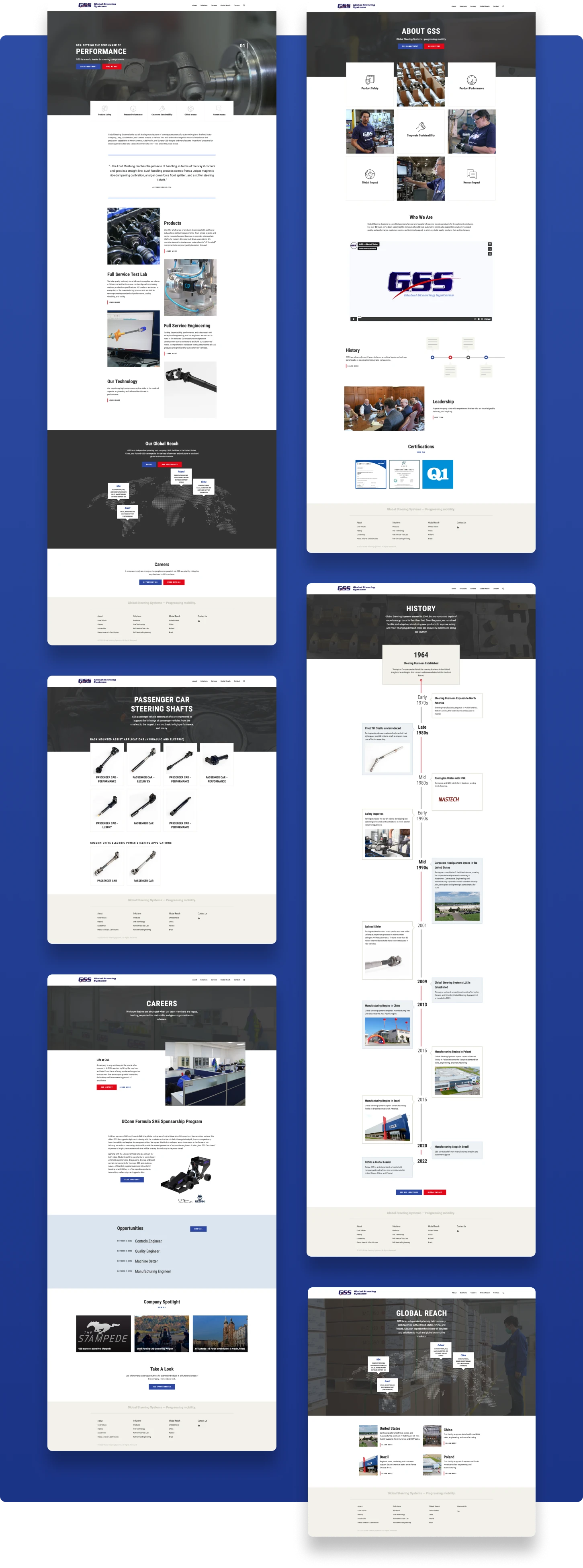
FULL PROJECT BREAKDOWN
IN-DEPTH RESPONSIBILITIES: LAYOUT DESIGNER AND USABILITY TESTER
I joined this project midway after the template handoff to stakeholders. I was the content designer and oversaw the project till the end. Before initiating any tasks, I typically immerse myself in the website, ensuring its functionality aligns with the intended design. I thoroughly check small-screen devices and assess navigation flow. I also examined the admin editor, to confirm the ins and outs of templates capabilities.
My majority of tasks involves placing refreshed content on the website, integrating multimedia elements such as photos and videos, and optimizing their presentation. Any needs for additional copy or adjustments will be addressed through collaborative discussions with the team and stakeholders.
Key Contributions:
- Collaborated with a copywriter to refine content, making adjustments to extend or condense copy as needed.
- Suggested additional content on the product page that leads into other product categories.
- Highlighted usability issues with a product display module(Figure 1) featuring tabs; users lost progress when clicking on non-default tabs and then selecting a product item. The module was later removed due to confusion and page placement concerns.
- Sole QA tester to verify cross browser compatibility and devices. Any visual and functionality errors were reported to Jira for the main developer to resolve.
- Provided stakeholders, a PDF tutorial outlining instructions for editing and adding content on WordPress as the final deliverable.

Figure 1
REFLECTION: UX/UI NITPICKS
As I was not involved in design and development phase of the WordPress template, I was not able provide feedback adjustments on its overall functionality. I did take note of some details during my term with the project and post deployment.
- Hero carousel could be done away with, in most cases, they have little to no user engagement for these type of websites.
- Preferred the map tooltip bubble to be 3 lines of text max.
- Page navigation could be improved, I took noticed of others experiencing a bit difficulty finding specific pages during stakeholder meetings.
- Products items page can use a breadcrumb or a back button to view current product category.
