PATRICIA BERNARDINI 2022 ELECTION WEBSITE
UX/UI | Brand | Front-End Development
Patricia is a distinguished member of the Weston community, having actively contributed to its growth and development for more than three decades. In 2022, she is seeking to take on greater responsibility as she runs for Commission Seat 3. Her goal is to address critical issues that affect the community and ensure that the cherished "Weston Lifestyle" is preserved for future generations.
INFO
TIMELINE
2021 — 3 to 4 Months
ROLE
Sole Designer and Developer
TOOLS
Wordpress, HTML, CSS, Photoshop, Procreate
TEAM
Secundino Paulino
Patrica Bernardini
* this domain hasn't been renewed since the election period has ended
OVERVIEW
For Patricia's 2022 campaign website, I had the specific objective of revamping the existing design and transitioning it to Wordpress that would allow for smoother and more efficient editing capabilities. This involved a comprehensive analysis of the current design's strengths and weaknesses, as well as an evaluation of the technological tools and resources available. I worked closely with Patricia to determine the site's design and functionality preferences. We discussed elements like color schemes, fonts, and imagery and how to incorporate them into the new template. This allowed Patricia to easily make updates and modifications to the website as needed, without requiring extensive technical knowledge or support.

FULL PROJECT BREAKDOWN
CHALLENGE
I was brought into the project as the designer and developer to overhaul Patricia's website and promote her candidacy for the upcoming 2022 election. In addition to revamping the website design within a constrained budget, I was tasked with evaluating the content, structure of navigation, identifying areas for consolidation, and determining what to omit.
Patricia's main requirements:
- Able to have control of editing content post deployment.
- Multi-language that supports manual transcribing for Spanish and Portuguese.
- A contribute/donation gateway that does not rely on main website to store user information.
RESEARCH
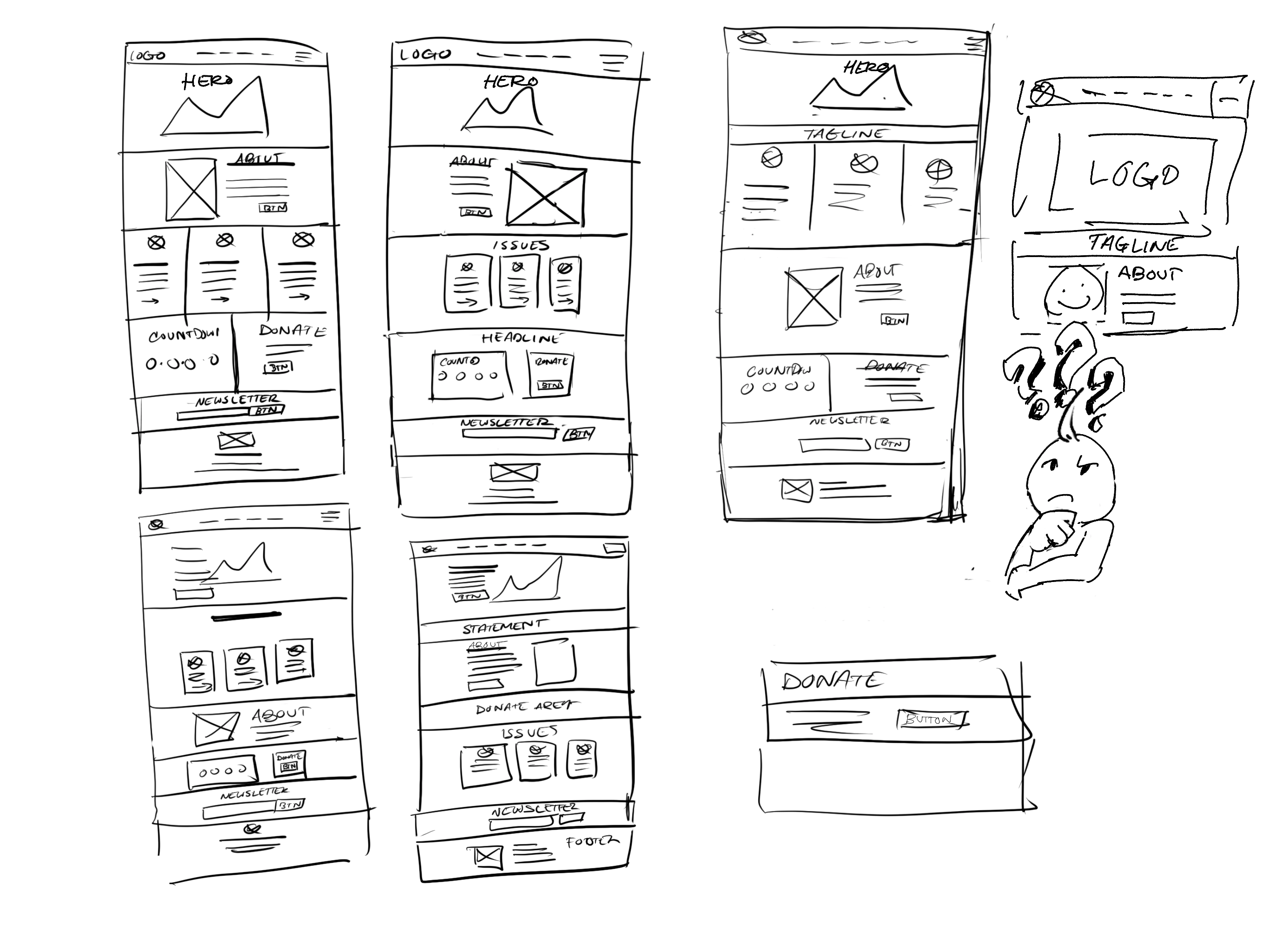
I scoped out the trends on other political candidates' home/landing pages to better understand and analyze their structure.
Things that I took note of:
- Main navigation can range from 5+ links
- Donation section CTA are repeated in a few spots
- Nice big image of candidate in the hero header area
- At least focusing on few subjects or issues to support
- The section order of "About" and "Issues/Priorities"
- Media or press info is near the bottom
- Newsletter sign up is before the footer
- Donation payment methods

Structure of general layout
DESIGN/DEVELOPMENT PROCESS
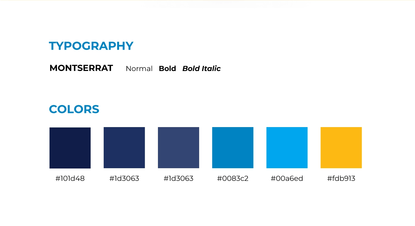
The decision was made to opt for WordPress as it aligned well with Patricia's requirements, primarily due to the availability of a free plugin for multilingual translation. The Nominee v3 theme/template was selected, then I had Patricia chose from a variety of template variants within the theme that resonated with her. The color theme was crafted to complement her logo.
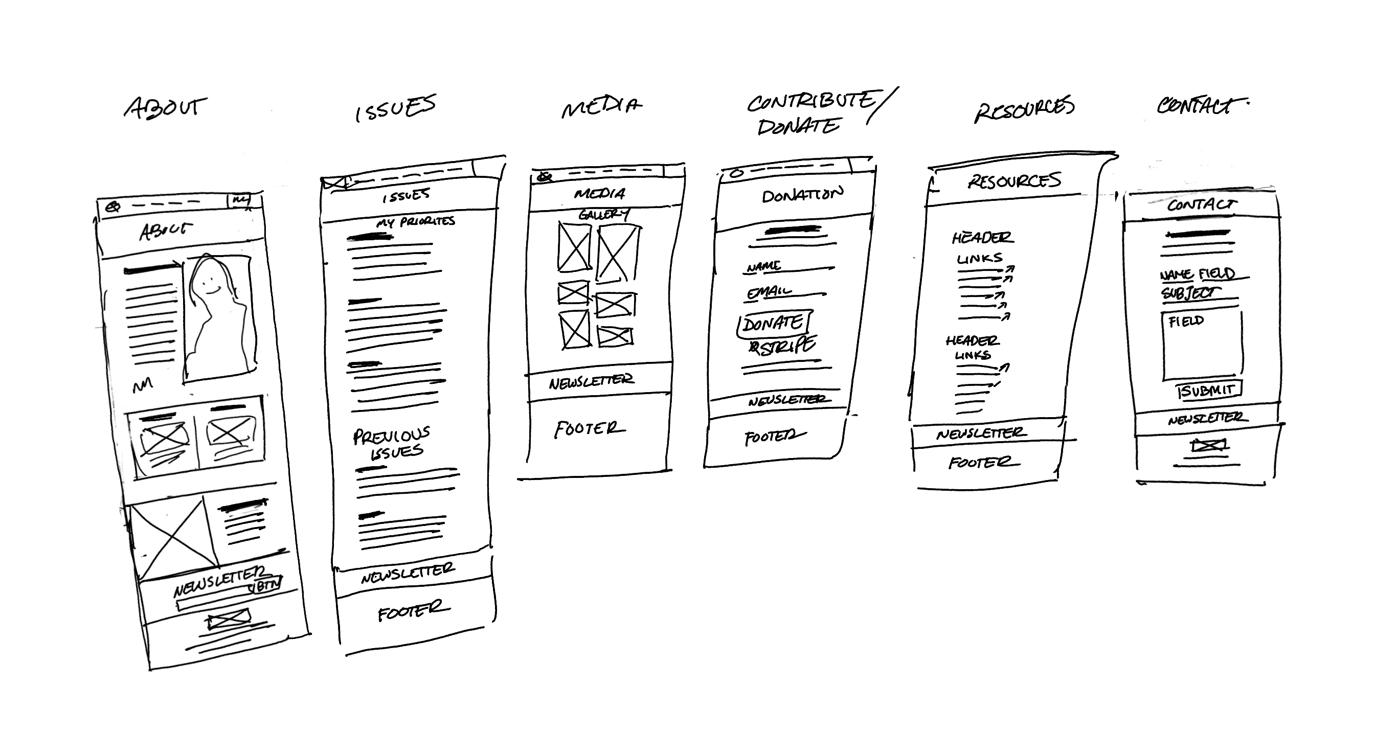
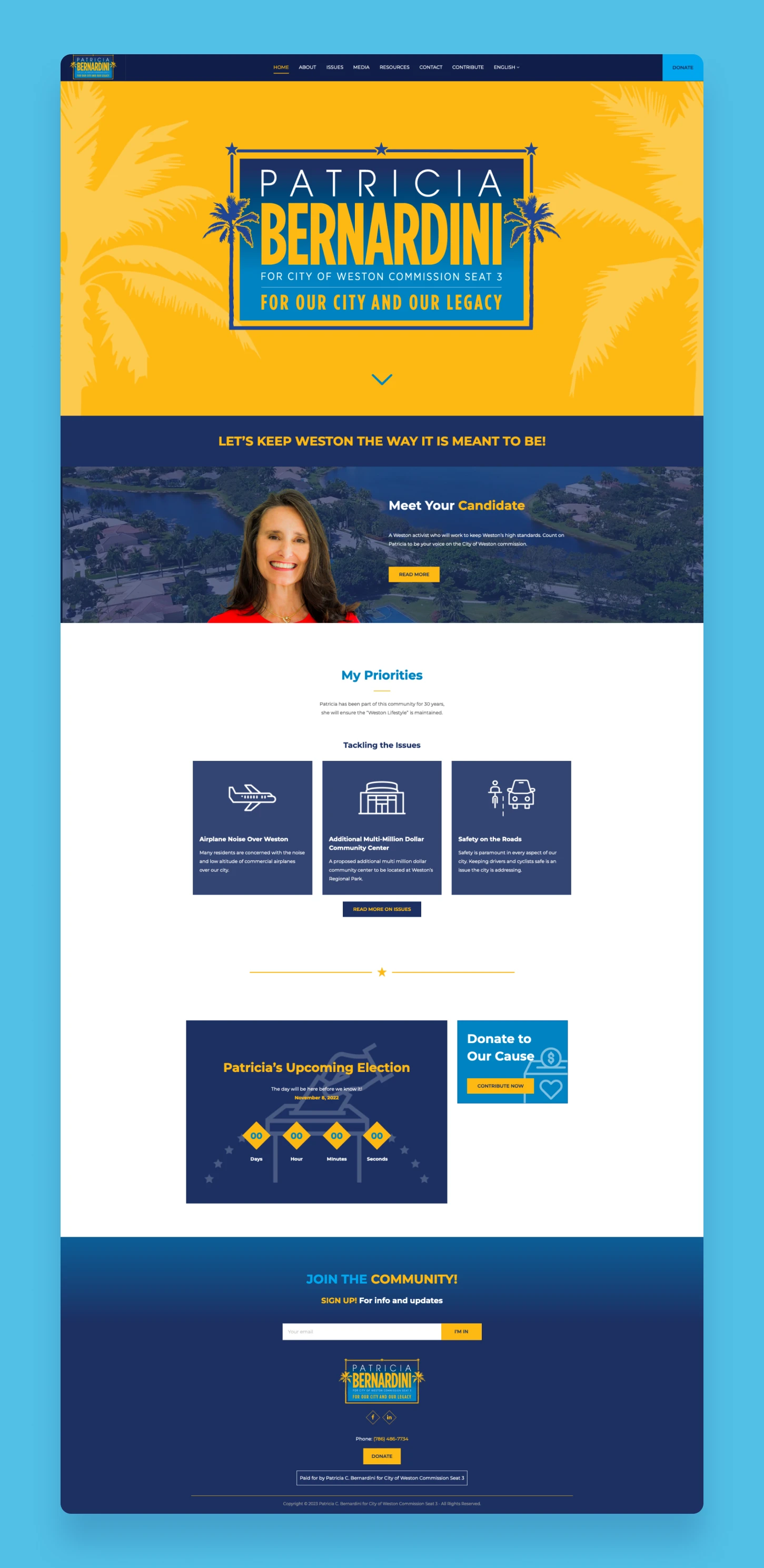
After testing the template, I focused on conceptualizing Patricia's home landing page. Considering her candidacy, I debated whether to feature the "About" or "Priorities" section after the hero header. Due to limited photos of Patricia, we decided to use an enlarged logo instead. This led to the natural choice of placing the "About" section next, and everything else fell into place.


Brainstorming home page and inner pages
The Charitable plugin was used for the theme, and the default form layout was standard across political sites. I disabled login, removed address and phone number fields to prevent user information from being stored in WordPress. Stripe was chosen as the payment gateway for its ease of checkout and lower service charges compared to PayPal.
During development, I faced issues migrating Patricia's site hosted on GoDaddy's simple sitebuilder plan. I couldn't access cPanel to migrate from my hosting server. We switched to basic hosting plan, but GoDaddy charged extra for SSL, which surprised me. I looked for free SSL plugins but found them inconvenient for Patricia. After discussing with GoDaddy support, we opted for a WordPress plan with included SSL, resolving the issue.

Finally after deployment was all set, including myself, Patricia, and a few of her closest supporters, we tested the usability to ensure the functionality of the website. A documentation guide was provided to Patricia to walk her through the steps on how to make updates and modifications to the content as the final deliverable.


Device views with forms, and translation
RESTROSPECT
For the two years following the deployment, I took the time to reanalyze the website's overall design layout and usability. One thing that has always stuck with me in this project is that I would've wished to leverage more professional photography of Patricia. If available, it may have made a significant impression of the website. The last third of the landing page could have used some rework; the election countdown widget didn't seem all that useful. Perhaps I should have used card containers for highlighting her accomplishments in the community instead.
Considering the advancements in multi-language support among website builders over the past few years, I would have chosen Squarespace or Wix if the premium features were within Patricia's budget.
One final note, don't use GoDaddy.